Why Color Matters More Than You Think
Color isn’t just decoration. It’s one of the most powerful tools in interior design because it works directly on your emotions and psychology. Before you pick a paint color or select furniture, you’re already making decisions that’ll affect how you feel in that space every single day.
Think about the last time you walked into a room that felt instantly relaxing. Or a space that made you want to leave immediately. That immediate reaction? That’s color psychology at work. Your brain processes color before it processes almost anything else in an environment — faster than form, faster than texture. It’s why restaurants use red and orange (they stimulate appetite), hospitals use blues and greens (they promote calm), and luxury brands use deep purples and golds (they suggest exclusivity).
In your home, this matters just as much. The bedroom color you choose will affect your sleep quality. The kitchen palette will influence how energized you feel while cooking. And your workspace colors will directly impact your productivity and focus. We’re not exaggerating here — this is backed by actual research.
The Three Main Color Categories
Color psychology generally breaks down into three main groups, and understanding each one helps you make intentional choices for different spaces.
- Warm colors (reds, oranges, yellows) create energy, warmth, and intimacy. They’re activating and social.
- Cool colors (blues, greens, purples) promote calmness, focus, and relaxation. They recede visually and feel spacious.
- Neutral colors (whites, grays, beiges, browns) provide balance and let other elements shine. They’re versatile and grounding.
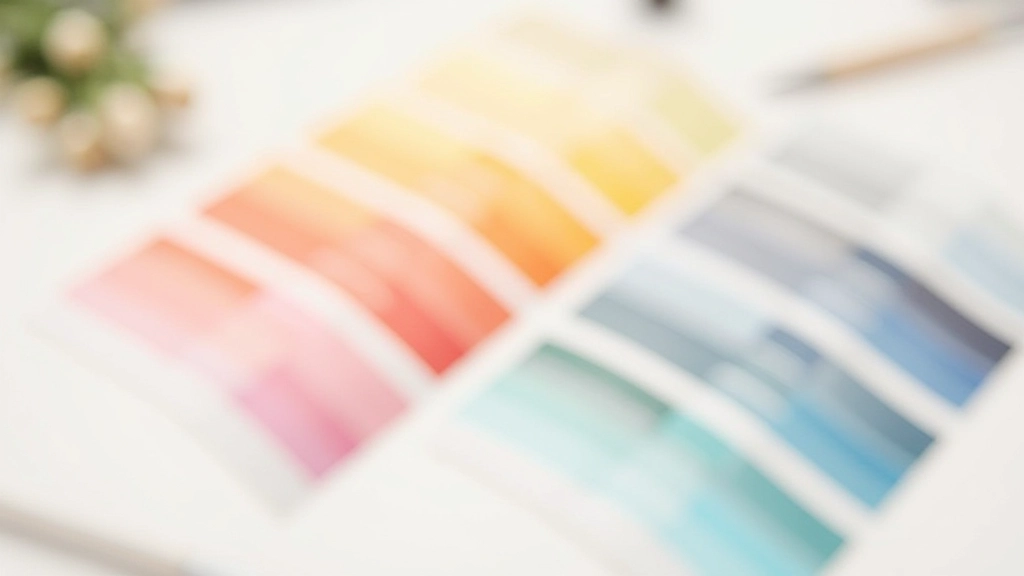
But here’s what most people miss: it’s not about the color itself. It’s about saturation, lightness, and context. A muted sage green feels completely different from a bright lime green. A soft warm beige creates a different vibe than a stark white. The undertones matter. The surrounding colors matter. The lighting in that room matters tremendously.
Choosing Colors for Different Rooms
Different rooms have different purposes, and your color strategy should reflect that. You wouldn’t use the same palette for a bedroom that you’d use for a home office. Let’s walk through how to think about the main spaces in your home.
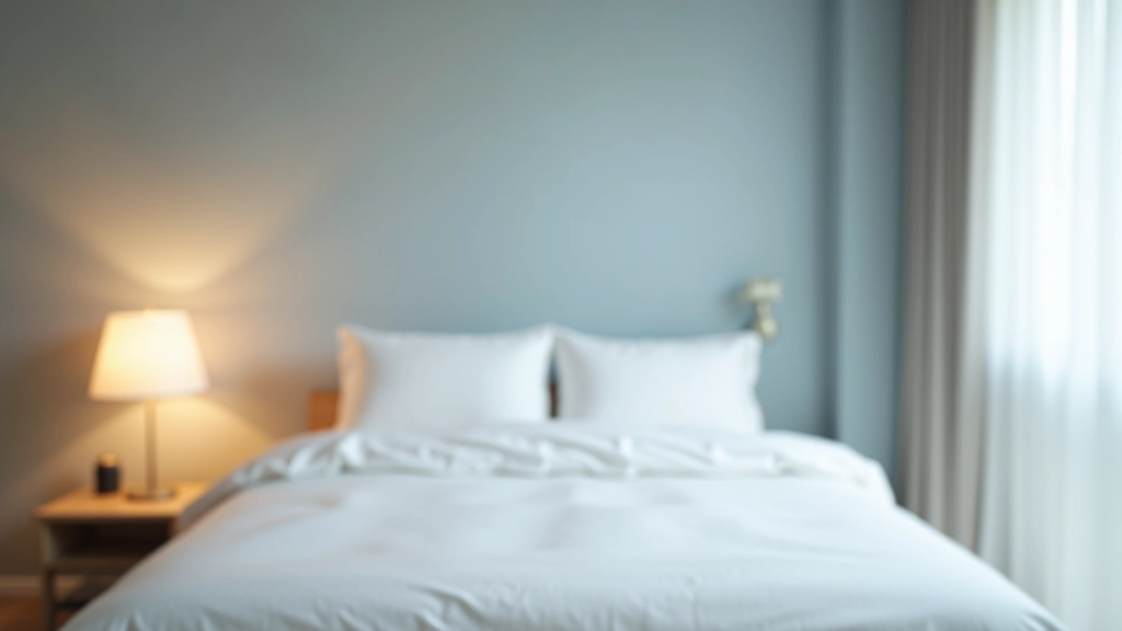
Bedrooms: Soft, Sleep-Inducing Palettes
Your bedroom is where you spend about a third of your life. It’s the space where you need to decompress and sleep well. This means you want colors that don’t overstimulate.
Best choices: soft blues, greens, warm grays, muted purples, and warm neutrals. These colors naturally lower your heart rate and encourage your body to wind down. A study from the National Sleep Foundation found that people who slept in blue rooms reported the best sleep quality — but it needs to be a muted, soft blue, not a bright pool-water blue.
Avoid: bright reds, oranges, vibrant yellows, and high-contrast combinations. These activate your nervous system, which is exactly what you don’t want at bedtime. If you love warmer tones, use them as accents (throw pillows, artwork) rather than wall colors.
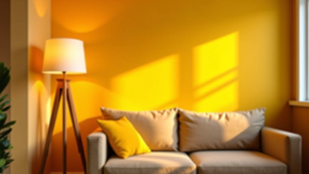
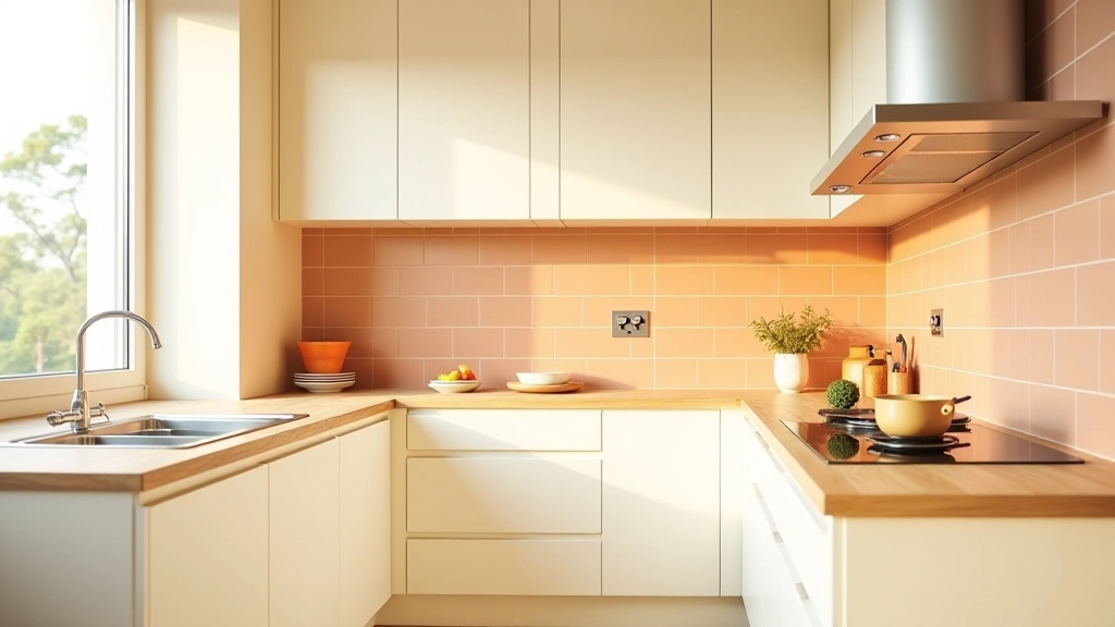
Kitchens: Energizing and Appetite-Stimulating
Kitchens are active spaces where you want energy, focus, and maybe a little appetite stimulation. This is actually where warm colors shine. You’re moving around, making decisions, and preparing food — you want to feel engaged.
Best choices: warm whites with yellow undertones, soft oranges, warm reds (think terracotta), warm greens, and creamy beiges. Red is famously appetite-stimulating — it’s why fast-food chains use it. But in a home kitchen, you don’t need pure red walls. Instead, incorporate red through appliances, backsplash tiles, or a single accent wall.
A practical approach: use neutral tones for larger surfaces (walls, cabinets) and introduce warmer, brighter colors through smaller elements you can easily change. This gives you the psychology benefit without committing to a paint job if you get tired of it.
Home Office: Focus and Productivity
Your workspace color affects concentration directly. You need a palette that energizes without overstimulating, focuses attention without becoming monotonous. Best choices include soft greens (they’re calming yet associated with growth and productivity), cool grays, soft blues, and warm whites. Avoid pure white — it’s too sterile. Avoid highly saturated colors that demand your attention.
Pro tip: if you work from home, paint one accent wall in a slightly more saturated shade while keeping other walls neutral. This gives you a focal point for concentration without the sensory overload.
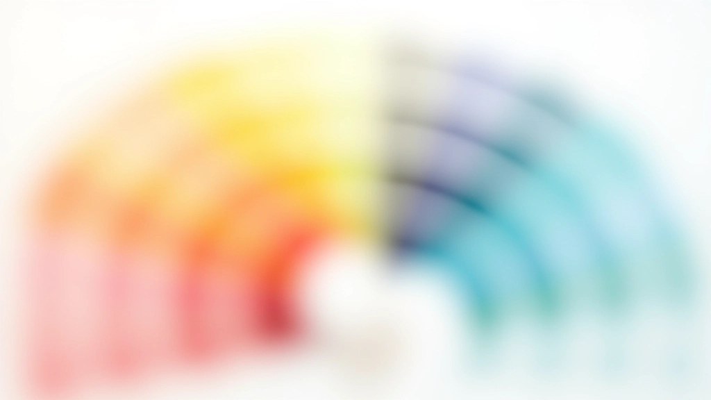
The Saturation and Lightness Factor
Here’s where most people get stuck: they know they want “blue,” but there are hundreds of blues. Is it navy? Powder blue? Teal? Steel blue? Each creates a completely different feeling.
The key is understanding saturation (how pure/intense the color is) and lightness (how bright/dark it is). A highly saturated, bright color demands attention and creates energy. A desaturated, lighter version of the same color is calming and spacious. A dark, saturated version feels dramatic and intimate.
For living rooms and main spaces, you generally want colors that are either moderately saturated and medium-light, or lightly saturated regardless of darkness. This keeps the space feeling balanced — not too stimulating, not too bland.
Making Your Selection
When you’re at the paint store or looking at color samples online, you’ve got to see them in your actual space. Colors look completely different under different lighting conditions. Natural north light shows cool undertones. South-facing rooms intensify warm tones. LED versus incandescent bulbs change everything.
Always get a sample and paint a large test area on your wall. Look at it at different times of day. See how it feels under your actual lighting. Don’t make decisions based on a tiny paint chip — you’ll end up with something that doesn’t match your expectations.
And remember: you can always paint over it. People get paralyzed choosing colors because they think they’re making a permanent decision. You’re not. If you pick a color and live with it for a month and hate it, you paint again. The cost of a gallon of paint is way less than the cost of living in a space that doesn’t make you happy.
Educational Information
This article provides general information about color psychology in interior design for educational purposes. While color psychology principles are research-informed, individual responses to color vary based on personal experience, cultural background, and preferences. For professional interior design advice tailored to your specific space and needs, we recommend consulting with a qualified interior designer. Results and preferences are subjective and depend on many factors including lighting conditions, room size, existing décor, and personal taste.
Start With What You Love
At the end of the day, color psychology is a framework to help you make intentional choices. It’s not a set of rules. You’re not painting your bedroom blue because science says so — you’re doing it because understanding color psychology helps you choose a blue that’ll actually support better sleep instead of picking one that overstimulates you.
Start by identifying what you actually love. What colors make you feel calm? What energizes you? Then use color psychology principles to find versions of those colors that’ll work in your space. Mute them, lighten them, or deepen them based on the room’s purpose and your existing lighting. Get samples. Live with them. Adjust as needed.
Your space should reflect you — and color is the fastest, most affordable way to make that happen. That’s the real power of understanding color psychology. It’s not about following rules. It’s about having the knowledge to make choices that create spaces where you actually want to spend time.